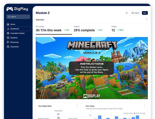
How We Built the DigPlay Brand
Most EU-funded projects introduce themselves with an acronym and a logo. DigPlay had a harder brief.
We had to build a brand that could do two things at once: speak to teenagers in the language of the games they love, and earn the trust of the educators, schools and policymakers who decide what counts as real learning. One audience wants energy. The other wants evidence. Lean too far in either direction and the whole idea falls apart.
Here’s how we built a brand that turns PLAY into PROOF — and looks like it means it.
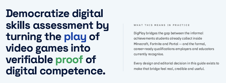
The brief: make “digital skills assessment” something a 15-year-old would actually click
DigPlay is an Erasmus+ Forward-Looking Project with a genuinely radical premise: that the digital skills young people build inside games like Minecraft, Fortnite and Portal are real competences worth recognising — mapped to the European DigComp framework, without another exam.
That premise only lands if the brand carries it. A project telling young people “your gaming counts” cannot look and sound like a policy document. But a project asking educators and employers to trust a new form of assessment cannot look like a games-marketing campaign either.
So before a single colour was chosen, we defined what the brand had to achieve: feel native to gaming culture, read as credible to education, and hold both without diluting either. That tension became the brief — and, as it turned out, the personality.
Choosing our character: the Rebel and the Sage
Every strong brand has an archetype. DigPlay has two, deliberately fused: Rebel × Sage.
The Rebel is the part that challenges the status quo. It’s bold, dynamic and future-facing — the voice that says no more boring tests and means it. It’s why the brand talks about pressing start, levelling up and turning play into proof, rather than about “assessment instruments” and “learning outcomes.”
The Sage is the part that makes those claims believable. It’s evidence-based, knowledgeable and grounded in European policy — DigComp alignment, pedagogical rigour, real research. It’s the reason a headteacher can take DigPlay seriously.
Holding both is the entire identity. The rule we set for every piece of communication: be confident and innovative without becoming a sales pitch, and evidence-based without becoming an academic paper. Rebel energy, Sage credibility — never one without the other.
The foundations: four ideas the brand stands on
From that character, four brand pillars emerged — the ideas every message, page and asset traces back to:
- Play to Proof — gaming skills are real digital skills, turned into meaningful evidence of learning.
- Pedagogical Rigour — every claim anchored in the European DigComp framework, so educators can trust it.
- Radical Inclusivity — digital potential exists everywhere, so the brand is designed to reach the learners most systems reach last.
- Invisible Evaluation — capability recognised in the flow of play, not through another stressful test.
These aren’t decoration. They’re the filter. If a design choice or a line of copy doesn’t serve one of the four, it doesn’t ship.
The build: giving DigPlay a face and a voice
With the strategy set, the identity came to life.
The wordmark and tagline. The name carries the whole story in one word — Digital and Play — and the strapline says the mission out loud: Turn PLAY into PROOF, under a single promise, unlocking digital potential through gaming.
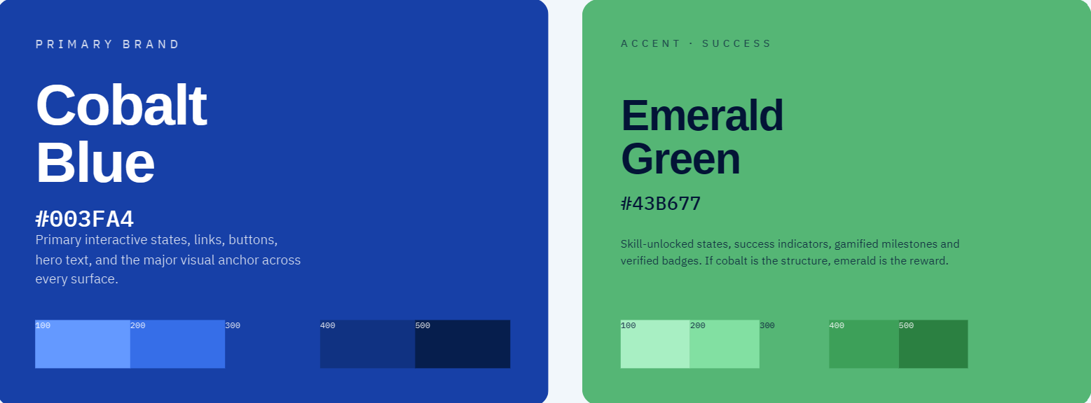
Colour. The palette pairs Cobalt Blue (#003FA4) with Emerald Green (#43B677). The blue does the Sage’s work — depth, trust, the credibility of something you can rely on. The green is the Rebel’s signal — go, growth, level-up, the colour of a system that says yes, proceed. Supporting neutrals and dedicated DigComp domain colours keep the wider system flexible and consistent.
Typography. Space Grotesk leads on headings and display — geometric, contemporary, a little bit game UI. IBM Plex Sans carries the body copy and on-screen text, chosen for clarity and readability at every size. Display energy up top; effortless legibility underneath — the Rebel and the Sage again, this time in type.
System and voice. A chevron graphic system and a defined icon set give the brand a consistent visual signature, while the tone-of-voice rules keep the language active, empowering and gaming-native — and firmly away from the vocabulary of exams, grades and failure.
The brand kit: one identity, five countries, one mission
For a project asking young people and educators to believe in a new way of recognising skills, the brand isn’t the wrapping. It’s the first evidence that DigPlay is genuinely different — that this really isn’t another test in disguise.
Every colour, word and chevron is there to make one promise legible before you’ve read a line of the research: your digital skills are real, and here they finally count.
That’s the whole point — turning PLAY into PROOF, starting with the brand itself.
Register your interest and follow the journey as DigPlay grows across Europe.